
Time to understand system status (70% Faster )
Before
2–3 min
After
40 seconds

Clarity for every decision.
Invez is an enterprise-grade fund accounting and loan management platform designed for financial institutions to manage deals, borrowers, accounting, and compliance workflows.

Lead Product Designer

Web App
12 months
Measurable improvements across key performance indicators
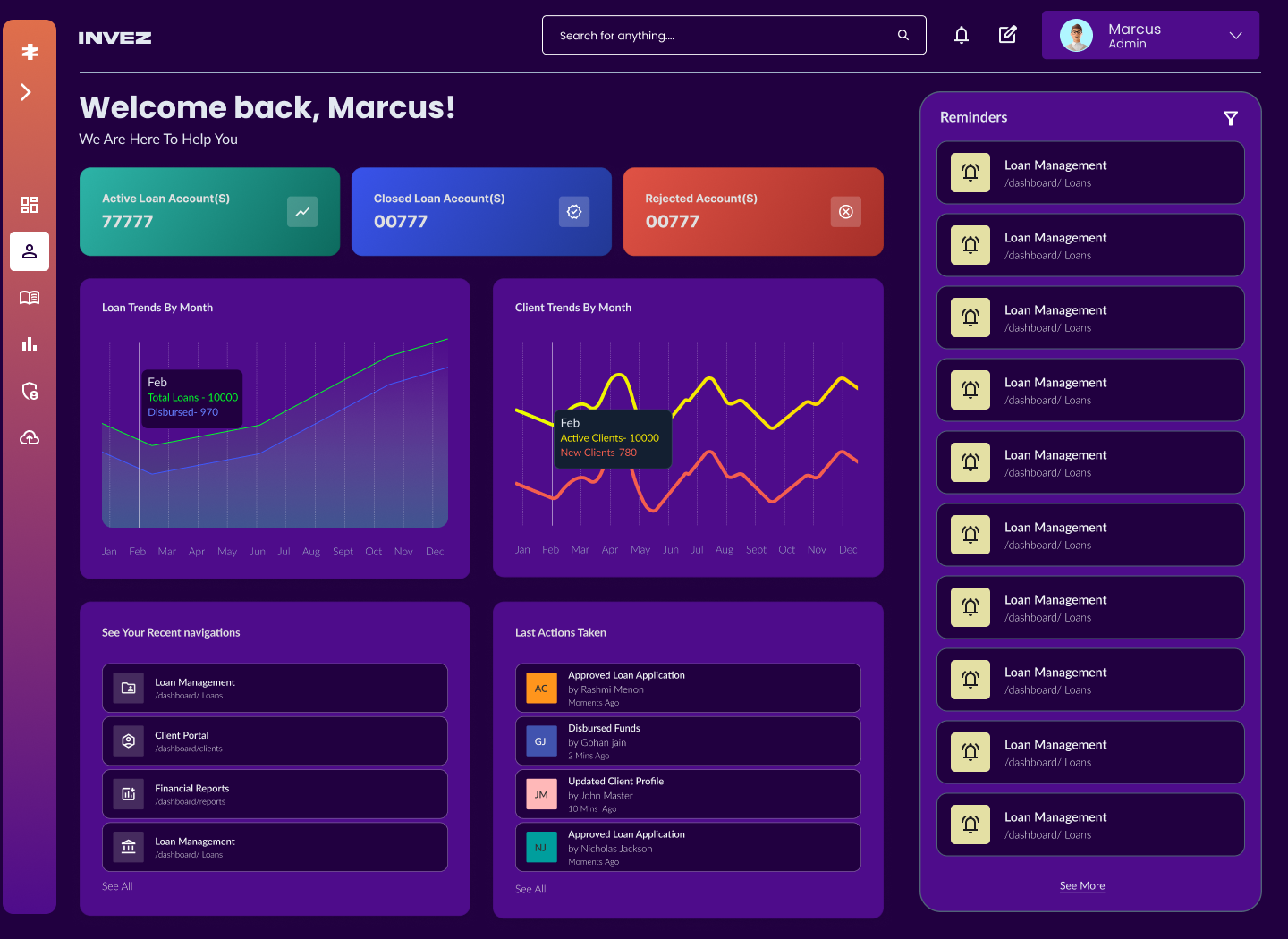
Dashboard
Operating with clarity at a glance.
Time to understand system status (70% Faster )
2–3 min
40 seconds
Missed alerts / reminders
2–3 min
25% fewer
Deal Details UI (Borrower / Loan Screen )
From scattered data to a unified decision surface.
Time spent per deal review
(~35–40% Faster )
15 min
9–10 min
Data lookup errors
(-35–40% Less )
2–3 min
↓ 20–30%
Audit Trail
Turning raw logs human narratives.
Time to review a change
(70% Faster )
3–5 min
↓ 1–2 min
Compliance confidence
2–3 min
High
Admin Panel
Designed for swift power tasks not exploration
Time to find admin function
(80% Faster )
2–4 min
<30 seconds
Support queries for admin tasks
2–3 min
↓ signficant drop
Measurable improvements across key performance indicators
Dense information displays with poor visual hierarchy overwhelmed users, leading to errors and slower decision-making.
While changes were technically logged, the information was presented in a raw, table-based format that required users to manually compare values to understand what had changed.
UI components weren't reusable, creating maintenance nightmares and inconsistent experiences across modules.
Data scattered across disconnected screens with no clear navigation hierarchy, forcing users to memorize complex pathways.
Clear goals guided every design decision

Call out a feature, benefit, or value that can stand on its own.

Implement step-by-step workflows with clear progress indicators and contextual help.

Create a scalable design system with reusable components and consistent patterns.

Reduce clicks, minimise context switching, and surface relevant data proactively.
Make modular, expandable cards that organize complex data hierarchies
Rather than forcing all information into rigid tables or endless scrolling forms, the Island Layout breaks content into logical, self-contained modules. Each island can expand, collapse, or show contextual actions—giving users control over information density.
Active Loan Account(S)
77777

Closed Loan Account(S)
00777

Rejected Account(S)
00777

Loan Trends By Month


Feb
Total Loans - 10000
Disbursed- 970
jan
Feb
Mar
Apr
May
jun
jul
Aug
Sept
Oct
nov
Dec
Client Trends By Month


Feb
Active Clients- 10000
New Clients-780
jan
Feb
Mar
Apr
May
jun
jul
Aug
Sept
Oct
nov
Dec
See Your Recent navigations

Loan Management
/dashboard/ Loans

Client Portal
/dashboard/clients

Financial Reports
/dashboard/reports

Loan Management
/dashboard/ Loans
See All
Last Actions Taken
AC
approved Loan Application
by Rashmi Menon
Moments Ago
GJ
Disbursed funds
by Gohan jain
2 Mins Ago
JM
Updated client profile
by John Master
10 Mins Ago
NJ
approved Loan Application
by Nicholas Jackson
Moments Ago
See All
Islands adapt to screen size and user preferences, maintaining clarity on any device
Data intensive tables presented with clarity through smart filtering, sorting, and status indicators
Features
Headers that are Sticky, inline actions, and horizontal overflow scrolling keeping the critical data sticky (to the left of the table) zkeeping users oriented in large datasets
A token-based system to maintain consistency, accessibility, and scalability

Semantic color tokens for states, emphasis, and accessibility
Light Mode
Dark Mode

Clear hierarchy with scale and weight variations
Poppins
Lato Bold
Lato Medium
Lato Regular

4px / 8px / 12px
4px grid system for consistent rhythm
16px / 24px / 32px
48px / 64px / 96px
50+ reusable components built on tokens
✓ Buttons & Forms
✓ Tables & Data Displays
✓ Navigation & Workflows
✓ Modals & Overlays
01
Color, spacing, typography primitives
02
Buttons, inputs, cards, badges
03
Islands, tables, workflows, dashboards
A token-based system to maintain consistency, accessibility, and scalability
Bold · Confident · Modern · High-contrast
-Clear KPI Cards with Emotional Colours
-Strong Visual Identity
-Consistency in island design Language
-Clear Information Hierarchy
-Easy Navigation to Performance history real estate
- Island-Based Sectioning (Signature Pattern) for Consistency
-Reduced Cognitive Load in Tables
-Enabling Progressive Disclosure Aiming to Reduce Cognitive Load on Actionable Items
Audit-safe · Serious · Purpose-built
-Strong Visual Identity
-Clear KPI Cards with Emotional Colours
-Consistency in island design Language
Systematic · Scalable · Low-risk · Admin-first
-Alphabetical Grouping = Smart
-Alphabetical Bookmarks for better navigation
- Separation Between Domains
- Card-Based Listing Improves Scanability
- Minimal Visual Noise- For Better Readability
Design systems is not just DOCUMENTATION, It needs to be drilled down.
A lot of conversations, iterations, and shared problem-solving with developers, product managers, and leadership—supported by prototypes, data, and research— made the value of design system tangible .
Progressive complexity beats one-size-fits-all
The idea was to reduce the cognitive load of novice users and not to limit the experts but enhance their capabilities . So we had to strip down the existing screens and just identify primary action items as default and the advanced features discoverable.
Replacing what is existing
Replacing a legacy system used by thousands required a phased rollout plan, extensive training materials, and feedback loops. We launched modules incrementally, gathered data, and refined based on real usage patterns.

Clarity for every decision.
Invez is an enterprise-grade fund accounting and loan management platform designed for financial institutions to manage deals, borrowers, accounting, and compliance workflows.
Lead Product Designer
Web App
12 months
Measurable improvements across key performance indicators
Dashboard
Operating with clarity at a glance.
Time to understand system status (70% Faster )
2–3 min
40 seconds
Missed alerts / reminders
2–3 min
25% fewer
Deal Details UI (Borrower / Loan Screen )
From scattered data to a unified decision surface.
Time spent per deal review
(~35–40% Faster )
15 min
9–10 min
Data lookup errors
(-35–40% Less )
2–3 min
↓ 20–30%
Audit Trail
Turning raw logs human narratives.
Time to review a change
(70% Faster )
3–5 min
↓ 1–2 min
Compliance confidence
2–3 min
High
Admin Panel
Designed for swift power tasks not exploration
Time to find admin function
(80% Faster )
2–4 min
<30 seconds
Support queries for admin tasks
2–3 min
↓ signficant drop
Measurable improvements across key performance indicators
Dense information displays with poor visual hierarchy overwhelmed users, leading to errors and slower decision-making.
While changes were technically logged, the information was presented in a raw, table-based format that required users to manually compare values to understand what had changed.
UI components weren't reusable, creating maintenance nightmares and inconsistent experiences across modules.
Data scattered across disconnected screens with no clear navigation hierarchy, forcing users to memorize complex pathways.
Clear goals guided every design decision
Call out a feature, benefit, or value that can stand on its own.
Implement step-by-step workflows with clear progress indicators and contextual help.
Create a scalable design system with reusable components and consistent patterns.
Reduce clicks, minimise context switching, and surface relevant data proactively.
Make modular, expandable cards that organize complex data hierarchies
Rather than forcing all information into rigid tables or endless scrolling forms, the Island Layout breaks content into logical, self-contained modules. Each island can expand, collapse, or show contextual actions—giving users control over information density.
Active Loan Account(S)
77777
Closed Loan Account(S)
00777
Rejected Account(S)
00777
Loan Trends By Month
Feb
Total Loans - 10000
Disbursed- 970
jan
Feb
Mar
Apr
May
jun
jul
Aug
Sept
Oct
nov
Dec
Client Trends By Month


Feb
Active Clients- 10000
New Clients-780
jan
Feb
Mar
Apr
May
jun
jul
Aug
Sept
Oct
nov
Dec
See Your Recent navigations
Loan Management
/dashboard/ Loans
Client Portal
/dashboard/clients
Financial Reports
/dashboard/reports
Loan Management
/dashboard/ Loans
See All
Last Actions Taken
AC
approved Loan Application
by Rashmi Menon
Moments Ago
GJ
Disbursed funds
by Gohan jain
2 Mins Ago
JM
Updated client profile
by John Master
10 Mins Ago
NJ
approved Loan Application
by Nicholas Jackson
Moments Ago
See All
Islands adapt to screen size and user preferences, maintaining clarity on any device
Data intensive tables presented with clarity through smart filtering, sorting, and status indicators
Features
Headers that are Sticky, inline actions, and horizontal overflow scrolling keeping the critical data sticky (to the left of the table) zkeeping users oriented in large datasets
A token-based system to maintain consistency, accessibility, and scalability
Semantic color tokens for states, emphasis, and accessibility
Light Mode
Dark Mode
Clear hierarchy with scale and weight variations
Poppins
Lato Bold
Lato Medium
Lato Regular
4px / 8px / 12px
4px grid system for consistent rhythm
16px / 24px / 32px
48px / 64px / 96px
50+ reusable components built on tokens
✓ Buttons & Forms
✓ Tables & Data Displays
✓ Navigation & Workflows
✓ Modals & Overlays
01
Color, spacing, typography primitives
02
Buttons, inputs, cards, badges
03
Islands, tables, workflows, dashboards
A token-based system to maintain consistency, accessibility, and scalability
Bold · Confident · Modern · High-contrast
-Clear KPI Cards with Emotional Colours
-Strong Visual Identity
-Consistency in island design Language
-Clear Information Hierarchy
-Easy Navigation to Performance history real estate
- Island-Based Sectioning (Signature Pattern) for Consistency
-Reduced Cognitive Load in Tables
-Enabling Progressive Disclosure Aiming to Reduce Cognitive Load on Actionable Items
Audit-safe · Serious · Purpose-built
-Strong Visual Identity
-Clear KPI Cards with Emotional Colours
-Consistency in island design Language
Systematic · Scalable · Low-risk · Admin-first
-Alphabetical Grouping = Smart
-Alphabetical Bookmarks for better navigation
- Separation Between Domains
- Card-Based Listing Improves Scanability
- Minimal Visual Noise- For Better Readability
Design systems is not just DOCUMENTATION, It needs to be drilled down.
A lot of conversations, iterations, and shared problem-solving with developers, product managers, and leadership—supported by prototypes, data, and research— made the value of design system tangible .
Progressive complexity beats one-size-fits-all
The idea was to reduce the cognitive load of novice users and not to limit the experts but enhance their capabilities . So we had to strip down the existing screens and just identify primary action items as default and the advanced features discoverable.
Replacing what is existing
Replacing a legacy system used by thousands required a phased rollout plan, extensive training materials, and feedback loops. We launched modules incrementally, gathered data, and refined based on real usage patterns.


Clarity for every decision.
Invez is an enterprise-grade fund accounting and loan management platform designed for financial institutions to manage deals, borrowers, accounting, and compliance workflows.
Lead Product Designer
Web App
12 months
Measurable improvements across key performance indicators
Dashboard
Operating with clarity at a glance.
Time to understand system status (70% Faster )
2–3 min
40 seconds
Missed alerts / reminders
Frequently
25% fewer
Deal Details UI (Borrower / Loan Screen )
From scattered data to a unified decision surface.
Time spent per deal review
(~35–40% Faster )
15 min
9–10 min
Data lookup errors
(-35–40% Less )
Moderate
↓ 20–30%
Audit Trail
Turning raw logs human narratives.
Time to review a change
(70% Faster )
3–5 min
↓ 1–2 min
Compliance confidence
Medium
High
Admin Panel
Designed for swift power tasks not exploration
Time to find admin function
(80% Faster )
2–4 min
<30 seconds
Support queries for admin tasks
Very High
↓ signficant drop
Measurable improvements across key performance indicators
Dense information displays with poor visual hierarchy overwhelmed users, leading to errors and slower decision-making.
While changes were technically logged, the information was presented in a raw, table-based format that required users to manually compare values to understand what had changed.
UI components weren't reusable, creating maintenance nightmares and inconsistent experiences across modules.
Data scattered across disconnected screens with no clear navigation hierarchy, forcing users to memorize complex pathways.
Clear goals guided every design decision

Simplify dense interfaces through progressive disclosure and clear information architecture.z

Implement step-by-step workflows with clear progress indicators and contextual help.

Create a scalable design system with reusable components and consistent patterns.

Reduce clicks, minimise context switching, and surface relevant data proactively.
Active Loan Account(S)
77777
Closed Loan Account(S)
00777
Rejected Account(S)
00777
Loan Trends By Month


Feb
Total Loans - 10000
Disbursed- 970
jan
Feb
Mar
Apr
May
jun
jul
Aug
Sept
Oct
nov
Dec
Client Trends By Month


Feb
Active Clients- 10000
New Clients-780
jan
Feb
Mar
Apr
May
jun
jul
Aug
Sept
Oct
nov
Dec
See Your Recent navigations
Loan Management
/dashboard/ Loans
Client Portal
/dashboard/clients
Financial Reports
/dashboard/reports
Loan Management
/dashboard/ Loans
See All
Last Actions Taken
AC
approved Loan Application
by Rashmi Menon
Moments Ago
GJ
Disbursed funds
by Gohan jain
2 Mins Ago
JM
Updated client profile
by John Master
10 Mins Ago
NJ
approved Loan Application
by Nicholas Jackson
Moments Ago
See All
Islands adapt to screen size and user preferences, maintaining clarity on any device
Data intensive tables presented with clarity through smart filtering, sorting, and status indicators
Loan Summary Table

Loan components
Principal
Interest
Fees
Penalties
Redemption Premium
Total
Original
Item Cell
Item Cell
Item Cell
Item Cell
Item Cell
Paid
Item Cell
Item Cell
Item Cell
Item Cell
Item Cell
Waived
Item Cell
Item Cell
Item Cell
Item Cell
Item Cell
Written off
Item Cell
Item Cell
Item Cell
Item Cell
Item Cell
Outstanding
Item Cell
Item Cell
Item Cell
Item Cell
Item Cell
Overdue
Item Cell
Item Cell
Item Cell
Item Cell
Item Cell
Features
Headers that are Sticky, inline actions, and horizontal overflow scrolling keeping the critical data sticky (to the left of the table) zkeeping users oriented in large datasets
A token-based system to maintain consistency, accessibility, and scalability
Semantic color tokens for states, emphasis, and accessibility
Light Mode
Dark Mode
Clear hierarchy with scale and weight variations
Poppins
Lato Bold
Lato Medium
Lato Regular
4px grid system for consistent rhythm
4px / 8px / 12px
16px / 24px / 32px
48px / 64px / 96px
50+ reusable components built on tokens
✓ Buttons & Forms
✓ Tables & Data Displays
✓ Navigation & Workflows
✓ Modals & Overlays
01
Color, spacing, typography primitives
02
Buttons, inputs, cards, badges
03
Islands, tables, workflows, dashboards
A token-based system to maintain consistency, accessibility, and scalability
Bold · Confident · Modern · High-contrast
-Clear KPI Cards with Emotional Colours
-Strong Visual Identity
-Consistency in island design Language
-Clear Information Hierarchy
-Easy Navigation to Performance history real estate
- Island-Based Sectioning (Signature Pattern) for Consistency
-Reduced Cognitive Load in Tables
-Enabling Progressive Disclosure Aiming to Reduce Cognitive Load on Actionable Items
Audit-safe · Serious · Purpose-built
-Strong Visual Identity
-Clear KPI Cards with Emotional Colours
-Consistency in island design Language
Systematic · Scalable · Low-risk · Admin-first
-Alphabetical Grouping = Smart
-Alphabetical Bookmarks for better navigation
- Separation Between Domains
- Card-Based Listing Improves Scanability
- Minimal Visual Noise- For Better Readability
Design systems is not just DOCUMENTATION, It needs to be drilled down.
A lot of conversations, iterations, and shared problem-solving with developers, product managers, and leadership—supported by prototypes, data, and research— made the value of design system tangible .
Progressive complexity beats one-size-fits-all
The idea was to reduce the cognitive load of novice users and not to limit the experts but enhance their capabilities . So we had to strip down the existing screens and just identify primary action items as default and the advanced features discoverable.
Replacing what is existing
Replacing a legacy system used by thousands required a phased rollout plan, extensive training materials, and feedback loops. We launched modules incrementally, gathered data, and refined based on real usage patterns.